In November 2020, the mainstay RI team presented at the Symposium on Substance Use Research hosted by the Rural Drug Addiction Research (RDAR), the Center for Biomedical Research Excellence (COBRE) on Opioids and Overdose, and the West Virginia Clinical and Translational Science Institute (WVCTSI).
The symposium provided the mainstay RI team the opportunity to share our work with peers, engage in productive dialogue and feedback, and reflect on our process up until this point.
The original presentation has been re-formatted for this post. The presentation was delivered by Toban Shadlyn via Zoom.
If you missed it: Origin Story (pt.1)
Where the mainstay, RI project is currently
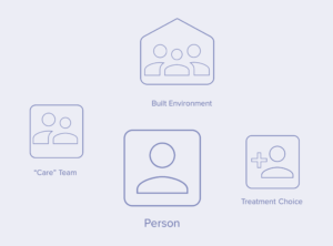
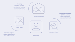
Since the 2019 hackathon win, the team has spent time further developing the project. From our initial research phase and conversations with various stakeholders, three distinct areas emerged for consideration in moving the project from a promising proposal to a more comprehensive plan:
- The Built Environment: the design of spaces (ie. What does a caring environment feel like? How do we design for safety, comfort, zero stigma?)
- Care Team Composition: the support system (perhaps we need to design new kinds of “care teams”)
- Treatment Choice: the many possible pathways to better outcomes (this is often medical treatment but it needs to expand to include housing, cultivating a sense of purpose, repairing relationships, and others. Oftentimes this is predefined, and defined quite narrowly).
One of the insights that came out of these conversations is the limited scientific research on how people who provide or receive care for opioid use perceive elements of that care – in particular the physical environment.
Precedents
As a designer – not bound by the system of scientific research – I look for information, insights, and inspiration all around me. These sources of learning can be closely related to the topic as well as analogous to it, often in unique or unexpected places/spaces.
For example, we are looking at exhibition design (temporary and mobile characteristics) to adapting existing infrastructure (permanent yet flexible) as we consider the potential for care and harm reduction in our built environment and physical spaces.
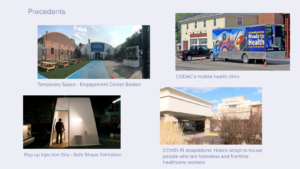
Pictured above:
- CODAC’s mobile health clinic: moves around to different neighborhoods across the state of Rhode Island
- The ‘Engagement Center’ in Boston: a temporary tent in a parking lot for people who are homeless to visit during the day, receive services, and connect with their community
- SAFE SHAPE: a ‘pop-up’ traveling exhibit in the form of a pavilion that operates as a mock drug consumption room (DCR). DCR’s, also sometimes referred to as Safe Consumption Sites, are not yet legal in the US. This is perhaps a creative roundabout way to still prototype something and solicit feedback from the public, while current challenges of legal barriers still loom.
- Wyndham hotel in Warwick RI: during COVID, they adapted their facilities to house people who are homeless and frontline care workers. Interventions like this, enable us to ask questions that maybe would have been “too far-fetched” to ask pre-COVID like: “How can we adapt existing architecture and spaces to provide harm reduction and recovery services?” (hotels, community centers, churches).
Though these precedents are helpful to a certain point, it is critical to understand the cultural context in which we are operating. What works in say a city like Vancouver Canada may not succeed if copy and pasted into Providence Rhode Island. These two places are very different from one another, with their own unique set of challenges specific to the context in which they are situated. However, understanding the key design principles that have led to successful societal outcomes can perhaps be transferred across different contexts.
Visuals
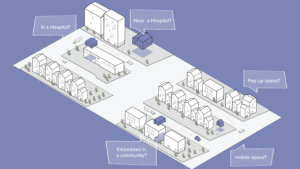
We have created visuals and sketches as a tool for engaging with one another and with external collaborators. These visuals are not intended to depict the solution, but rather a tool for asking questions, prompting conversations, and creating shared visions of what could/should be (provocations of a preferred future).
As an example we created the visual above to spark a conversation around the different possibilities of mainstay, RI as a place and/or space: “Is mainstay a room or in a wing of a hospital? Is it near the hospital, or embedded in the community? Does it move around from neighborhood to neighborhood? How flexible or permanent is the place, does it pop up and pop down?” Is it a combination of all of the above…?!
These questions and visuals help us not only confront the practicalities and specifics but open up space to engage in conversations that radically reimagine how we understand and design for “care”. Does care for substance use require the presence of medical support? What would it look like to design care around connection?
IRB Research & Interviews
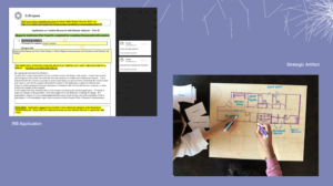
Currently, we are in the process of conducting interviews with people who use opioids and have experienced an overdose, as well as those who care for people who have overdosed (nurses, friends, peer recovery coaches). Due to the nature and sensitivity of this topic, it was important for our team to obtain IRB (Institutional Review Board) approval, to engage with this particular group while ensuring their protection and confidentiality. These conversations are intended to surface insights around the 3 focus areas: care team composition, care treatment, and care spaces.
The image on the left is a screenshot of our IRB application (likely familiar to all the scientists reading this). But for our team, some of us are learning to navigate the IRB system for the very first time. While others on our team are learning about some of the informal and interactive ways designers might engage with people. The image on the right is a prototype of an engagement tool for sketching people’s experiences in care spaces and how they would redesign a space for care.
These tools are important to show in tandem. We are interested in creating conditions and relationships that aren’t limited to the transfer of information but can enable co-creation. Providing people the tools (in this case a whiteboard and pen) to communicate, collaborate, and design.
Where the project is going
While IRB interviews are underway (we will be sharing the insights from those conversations in the coming months), we have also been speaking with other folks across the problem space (ie. law enforcement, community-based organizations, etc.), learning from their unique perspectives to help inform the project. Some initial themes are:
* Provider fatigue amongst:
- Health care providers (there is a shortage of bilingual care professionals in Rhode Island)
- Police administering naloxone daily (secondary trauma and fatigue)
- Family members providing ongoing support
* The urgency and need for different kinds of housing support
* The rapidly changing landscape of treatment (due in large part to COVID-19)
Many of these insights are not surprising but are important to surface as they reveal information that is unique to the Rhode Island context.
As we head into Spring 2021, the team will be wrapping up our IRB research and interviews which will close out our current grant funding. We will spend some time reflecting on our learnings over the past year and strategizing the next steps for the project. Stay tuned for part 3!
Visit the website to read more: mainstayri.org
– Written by Toban Shadlyn. March 2021.
In November 2020, the mainstay RI team presented at the Symposium on Substance Use Research hosted by the Rural Drug Addiction Research (RDAR), the Center for Biomedical Research Excellence (COBRE) on Opioids and Overdose, and the West Virginia Clinical and Translational Science Institute (WVCTSI).
The symposium provided the mainstay RI team the opportunity to share our work with peers, engage in productive dialogue and feedback, and reflect on our process up until this point.
The original presentation has been re-formatted for this post. The presentation was delivered by Toban Shadlyn via Zoom.
A short introduction about myself. I work at the Center for Complexity at Rhode Island School of Design, leading the work around Opioids, Care, and Addiction. I am one of the members of the mainstay RI project. We are a multidisciplinary team of five, comprising a nurse, a health researcher, a community organizer, a journalist, and a designer.
I will introduce the mainstay RI project — its origin story, where the project is, and where it is heading. I will also share reflections on what this collaboration has been like. Each of us comes to the work from different disciplines and perspectives, and it’s been both wonderful and challenging to bridge the world of science and design.
(This post will cover the origin story, with posts to follow that will cover the Present & Future state of the project, and Reflections).
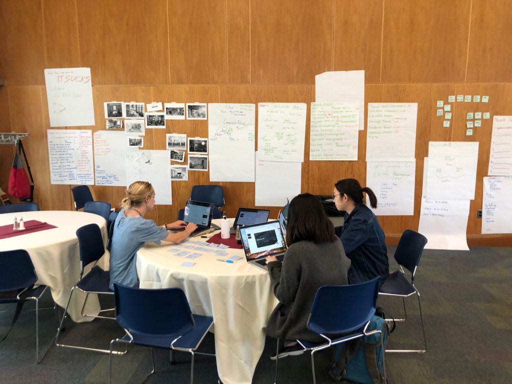
Half of the members of the mainstay, RI team busy working during the hackthon weekend. 2019. Photo by Tim Maly.
The Origin Story
Before jumping into describing what mainstay RI is, it is worth taking a minute to explain how the project came to be.
In September 2019, the Center for Biomedical Research of Excellence (COBRE) on Opioids and Overdose hosted a community hackathon “to inspire individuals to come together and change the course of the devastating opioid and overdose crisis in Rhode Island.” Members of the Center for Complexity team and employees of Infosys attended. For us, the event was an opportunity to meet people working in a shared challenge space, and spend a weekend in a creative making mode to create something that could potentially be impactful.
Upon arriving at the hackathon, our cohort quickly split up, connecting and forming teams with other attendees — people we had never met before. The team that ultimately developed the original idea of mainstay RI, consisted of a health researcher (Hannah Dalglish), a community organizer (Michael Beauregard), a journalist (Tim Maly, CfC), a registered nurse (Leigh Hubbard), and two user experience designers (Ivy Lim and Namhee Kwak, Infosys) (see picture above). (I joined the team post hackathon).
During the weekend hackathon, the team chose to focus on the challenges that occur when someone wakes up from a drug overdose (usually because of something laced with fentanyl) — from the aid of Naloxone.
We spoke with clinicians about their personal experience with substance use and/or working on the front lines providing care for people with substance use disorder. We also spoke with many advocates for people who use drugs. We learned that while it is common for some people to wake up from an overdose in public (in their cars parked on the street, public bathrooms, etc.), more often than not, they wake up in an Emergency Department (ED). In 2018 alone, there were over 1,500 ED visits for overdose in Rhode Island (Prevent Overdose RI).
The experience of waking up from an overdose is painful. Many are disoriented and experiencing withdrawal symptoms. All they want to do is leave the chaotic environment of the Emergency Department. It is often at this point in the care chain that help is offered. However, the person who has just come out of an overdose is rarely in a place or position (both physically and physiologically) to accept help then and there. They end up leaving the Emergency Department, thus losing an opportunity in the care chain to provide support.
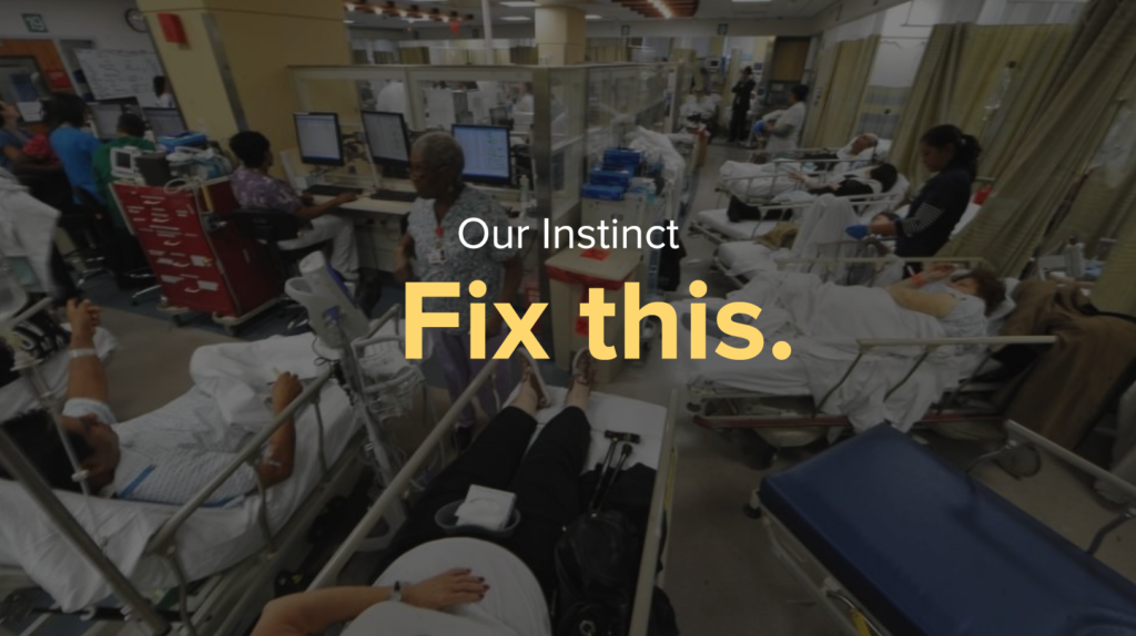
Our first intuition was to intervene in the Emergency Department. Could it be redesigned to better support people in this acute moment after an overdose? The challenge with this is that the Emergency Department is designed specifically with a fast and hard approach to care. Someone waking up from an overdose, although it is an acute moment, does not respond well to this. Rather than redesigning the Emergency Departments (as we still need ED’s to address acute care) we saw this as an opportunity to intervene elsewhere in the system, providing a “soft and slow” approach to care for those who have been brought back to life after an overdose.
A ‘soft and slow’ approach
mainstay RI is (currently a notional) place for people to go after they’ve woken up from an overdose. It takes the agency of people who use drugs as its first priority and attempts to create an environment where care workers and peers can enable people to define and follow their own path to better outcomes.
This was the pitch we presented at the Hackathon along with initial sketches of the space, ideas around the kinds of services that might be offered, and the principles that would guide its operations. An environment without judgment, that provides comfort, and supports each person’s choice.
The proposal won first place, awarding us $5,000 to continue to develop the project.
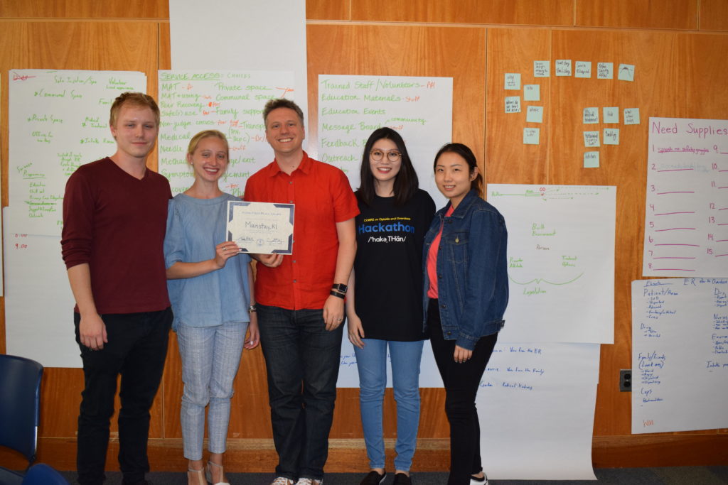
The mainstay RI team, awared $5000 from the hackathon (missing Leigh Hubbard). 2019. Photo by COBRE.
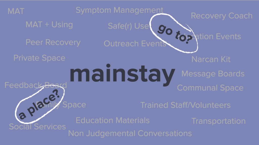
The hackathon allowed us to test the initial idea in a room full of scientists, clinicians, advocates for people who use drugs, and policymakers. It was a great starting point for a weekend sprint. But of course, we still had a lot of questions before continuing down a solutionist pathway. “What do we mean by place? Where is it? How do people get there? What happens once you’re there? How do we design for trust? How do we account for safety, and what does ‘safety’ mean in this context?
Equipped with these questions and more, we needed to advance the project from a promising concept towards realized ideas. Eventually, bringing together people who would be using the space/services into the process of co-designing and shaping it alongside us.
Read Part 2: Present and Future
Visit the website to read more: mainstayri.org
– Written by Toban Shadlyn. Visual identity by Nick Larson. February 2021.
Studio is a container term that holds many meanings for those of us with studio-based practices. This multiplicity of meanings is not troubling in its ambiguity because that container is irreducible to each of its parts, but we can unpack this variety to call attention to all of the ways a studio serves us. We can be precise when we examine what the studio offers us.
We’ve worked individually to communicate what each of us values about working, facilitating, and teaching in studios. Below those thoughts are clustered into loose categories, anchored in the concepts of space, time, people, and materials. The flow between these categories is truly what makes studio a magnificent idea worth considering, especially now. Before we consider all the complexity of those flows, we begin with these small windows.
Studio is Time
A studio induces commitment to the work
“Go to your studio” is a common admonishment in design circles. In this phrase is the conviction that once one enters into the studio space, the purpose of the space will result in work. Studios invite engagement with design by merely existing. When a designer enters a studio they might be compelled to organize, make markings, look at work, or think deeply about a recent event. The practice of saying yes to these inclinations is what keeps a designer in shape. It’s a designer’s vitality.
A studio is a process-oriented mechanism to generate outcomes.
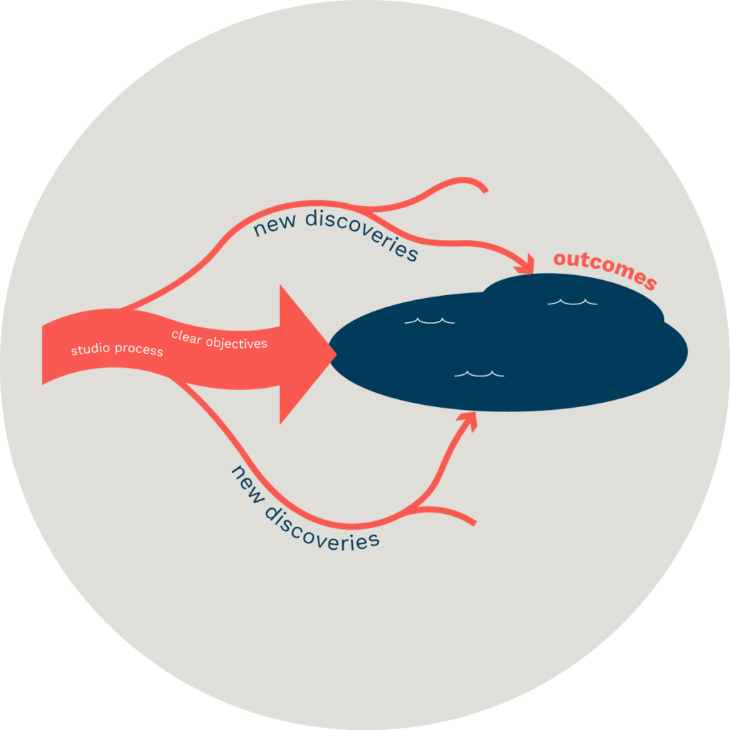
The thing about studios is that you don’t know how it’s going to turn out. Even when you enter into a studio with clear objectives, it’s not uncommon to throw out those objectives as new discoveries along the way cause you to rethink and reframe what you are guiding towards, so we rely on process to get us there. We don’t know exactly where we are going but we do know how to navigate safely and effectively.
The funny thing about process is that this often ends up shifting as well. It’s common to enter with a plan for a series of activities only to find that what the studio effort needs is something else. This is not unlike an expedition discovering an unexpected lake. So you go back to your toolkit and break out a different set of traversal tools, loading what you need onto the boats and leaving behind cargo that’s become a hindrance.
A studio is an opportunity for intensive, wide-ranging inquiry.
We say intensive because in our experience, a burst of concentrated attention on a challenge leads to more fruitful results than an extended period of juggling priorities. There are diminishing returns to extending the inquiry. This is counter-intuitive.
We say wide-ranging because one of the things we look for studios to do is break people out of narrow fields of concern or narrow ranges of problem spaces.
A studio provides structured unstructured time
Individuals and groups working in a studio have dedicated time to allow for the creative process to take form with little to no road map. A studio is not rigid in its rules and processes and allows for dedicated time where happenstance and creative collisions can be noticed, explored, embraced, developed, and shelved.
A studio nourishes potentials and possibilities
A studio encourages the novel, unknowns without fear of “failure” by not just holding a multiplicity of tools and spaces that encourage creative exploration and experimentation; but by creating a safe and malleable environment for a community of creatives.
Studio is Space
A studio is close to field sites
Primary, observation based research in the field is an essential part of any design process, and it doesn’t just happen in the upstream stages of design. Consistent access to field sites for early stage observation and thick description is essential. This allows the designer to widen the scope of an inquiry and arrive at a transformative reframing of a problem or opportunity. Returning to the field site further downstream in the process to inject design probes or release design prototypes keeps work rigorous, validated and nimble.
A studio allows for fluidity
A studio provides avenues for one’s creative journey that can meander, pivot and change without breaking the creative process. The studio tools, space, and community are available to and distributed amongst those in a studio so that they each reach their creative and investigative potential.
A studio provides grounding during the creative process
As designers/creatives go through various stages in the design process – research, ideation, testing, connecting, discovering insights, making, critiquing and reflecting. The studio provides a space of familiarity and safety to ground ones thoughts and actions though this process. The studio is a safe space for continued practice that can be molded to what the context requires.
Studio is People
A studio is hospitable to visitors
One essential principle of design is that design artifacts and outcomes advance clarity of thought for both designers and those engaging with designs. Before the design process is complete, inviting others to visit the studio and engage with the work accelerates a designer’s ability to understand and validate their own thoughts. Hospitable spaces are those that welcome guests and welcome them into physical and mental engagement with the work.
A studio builds a community
A studio builds a community by being a shared space that holds tools to be shared. This creates a connection between individuals even though the space and tools might be used differently during individual creative processes. It allows for the praxis of multiplicity of uses and realities with a given object and given context.
A studio holds its community accountable
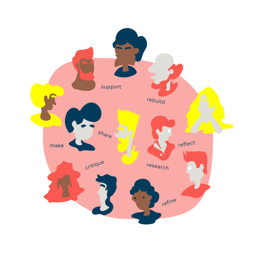
A (good) studio holds individuals accountable to their own growth and the development of others through critique, support, prototyping, making, refining, breaking, rebuilding etc. A studio and all it holds (both tangible and intangible) becomes “the commons” that is nurtured during the creative process. Tangible assets/tools, and space in a studio are treated as valuable assets in the creative process.
A studio community is self-motivated praxis
Those in a studio are motivated in the individual and collective creative praxis. A studio allows one to be present yet not beholden to a particular method, mode, idea or vision. A studio is conducive to putting into practice various methods, modes, ideas and visions in generative ways.
Studio is Material
A studio supports physical objects
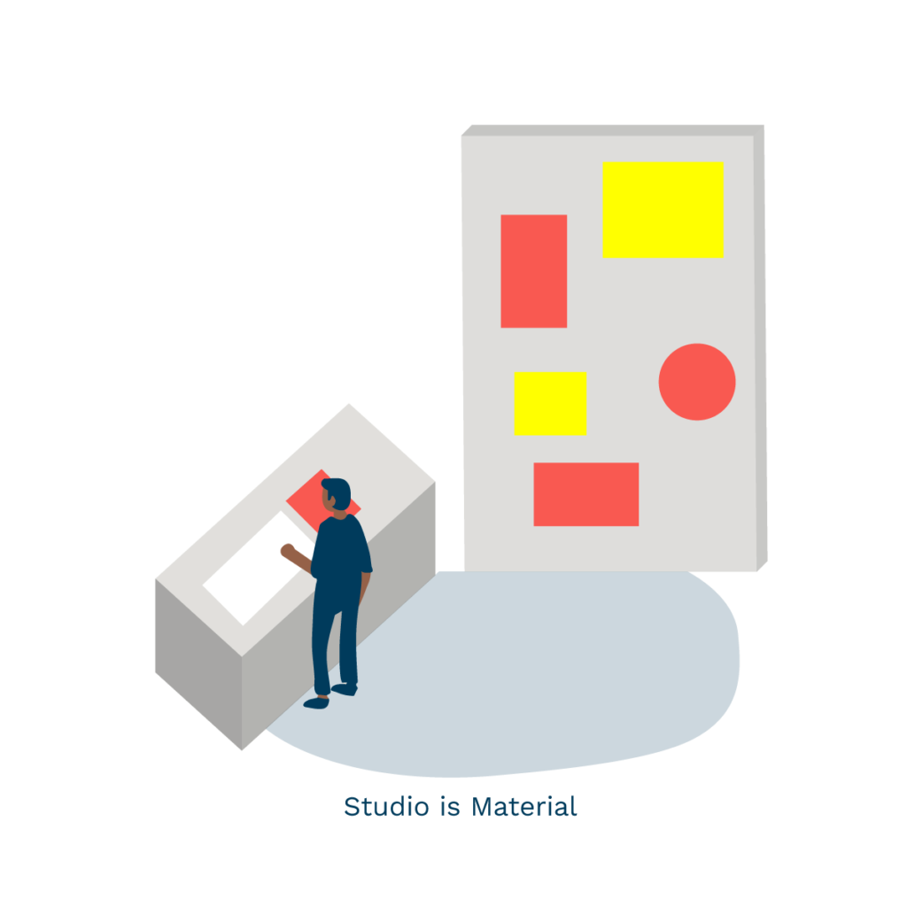
A digital screen can be an essential tool in the design process, but a computer is not a studio. Horizontal space to make marks and manipulate materials greatly increases one’s ability to think at a slant, and display thinking to collaborators. Vertical space to display past work helps insights stay relevant as the momentum of each day carries the designer to new conceptual places. Maintaining a healthy flow from horizontal to vertical space, and archiving physical work for revisiting on future projects, builds a designers process and practice from project to project.
– Written by Katie Edmonds. Graphics by Jack Tufts. November 2020.
When we attempt to address the conditions of quarantine, natural disaster and social unrest it’s easy to begin by listing what we’ve lost, because we’ve lost a lot. What if we asked what is gained?
As practitioners at the intersection of learning and design, and as thinkers situated in a studio oriented institution, the studio is an anchor and foundation to our work. Every day as we proceed through this moment in time we are challenged to ask where, who and what our studios are, because last year’s answers to that question no longer suffice. Do we know our studios well enough to nurture the elements of studio time, collaboration and practice that we need most right now?
What follows after this introductory piece is a series that seeks to interpret this moment through the mercifully narrow keyhole of studio thinking, work and exchange.
To kick that off, here are three categories that we can use to pivot our thinking away from the losses and toward the gains.
- Synchronous and asynchronous time
- Shared and personal space
- Mediated encounters
In and out of synchronous time
When a studio is embedded in the home, the beginning and end of studio time is based on how work integrates into the other activities of home life. The “when” of the studio is no longer designed around mobility or institutional operating hours. Each member of a studio has distinct constraints to keep their household operational, so we can’t rely on our temporal patterns matching up with the patterns of the people with whom we work.
When we lose the uniformity of shared time we gain the agency to determine when studio time fits into the rest of our life, and the challenge to protect and honor that time. When our work is more closely knit into our lives, how does that influence our work? Do we consider these “interruptions” of caregiving and intimate relationships as something other than interruptions? Does this moment induce a generative reframing of our past studio time as decontextualized, and frame the present as being highly contextualized and therefore full of the beneficial complexity, friction and texture of vitality?
Spatial homogeny and variety
A shared studio is distinct from the diaspora of personal spaces because it provides an empty, common, material and spatial template to those practicing within it. We import discovery artifacts and raw materials into the studio to practice material interrogations, and as we practice the empty spatial template is filled by the variety that is ourselves and our work. As we generate and display that work in the studio, we are filling an empty template. When we work at home we making in already full, deeply human, materially heterogeneous contexts with their own aural and visual properties. Our homes are active sites, rich with nuance, and the work we make here is informed by everything the home-as-site has to offer us. When the time comes to encounter each other’s work, that work can benefit from being situated in these sites. What if we take agency in the home-as-site opportunity? What if the way our spaces and the work is mediated to the outside gaze is as intentional as the work itself?
Intentional mediation
The ceremonial tradition of design presentations occur in deeply familiar spaces. We paint a very spatial mental picture when we think of an academic studio pinup, a final critique, a professional first look meeting or a final presentation to a client,. To some extent these rituals are inextricable from the sites in which they occur, and it’s challenging to imagine a different site, or a different process, because the studio was always there for us. Now that the studio conditions have changed, a designer is charged to ask the questions that media studies scholars have been investigating for decades: what media might we choose to produce the encounters we seek to have? While we’ve lost the benefit of body language communication, tactility and water cooler moments, we’ve gained the precision required by and amplification provided my other mediums, including digital ones. Indeed it takes a significant amount of work to exercise agency in assembling a media ecosystem that advances our work. It also takes a significant amount of thought to exercise agency when using media ecosystems that may be imposed on us. The studio protected us from these matters, and suddenly that protection is gone.
As designers the overwhelming challenge and vastness of the opportunity space is a bit stunning, but I think we’re going to rise to the challenge, because we’re designers. We hope that that writing that follows this introduction brings you a bit of peace and reflection to mitigate the chaos of everything 2020 is bringing us. We would love to hear from you if you find these pieces moving or inspiring, and of course if you find them worthy of robust critique.
– Written by Katie Edmonds. September 2020.
June 9 2020: The murders of George Floyd, Breonna Taylor, and Ahmaud Arbery, the protests demanding an end to police violence, and the disproportionate effects of COVID-19 on black and brown people demonstrate once again that racism and racist ways of knowing are endemic.
Racism continues to tear us all down and limit our potential as a species. Racism destroys our ability to see in each other our common fate and makes collective action toward shared purpose impossible.
If we are to truly embrace the complexity inherent in our world as a way to advance wellbeing, sustainability, equality and justice, then we must confront and undermine racism as an unjust, inhumane and an anti-complexity way of ordering the world. We at the CfC pledge to identify and confront racism; to make the elimination of racist structures and ideologies core to our practices. We pledge to move anti-racism from where we have misplaced it at the margins of what we do, to the center. I pledge to examine my own race and privilege and to review our policies and structures to ensure that they are anti-racist.
In our projects, we have confronted challenges that we knew were hard and complex, but did not take the extra step of naming them and treating them for what they were. For instance, in our nuclear threat reduction projects, we often speak of “front line communities” as an important voice in understanding the impact of nuclear weapons on people even without their recent use in war. But we should have named the fact that many of these communities were on the “front lines” because of racism, and then worked to unveil how racism has shaped the national security system we have today. In our work on the future of education, we knew that “career and college readiness” was insufficient to the task of shaping education for this century. But we didn’t name how racism must be dismantled in order to create a system of learning that benefits all and then change our approach accordingly.
Beginning now, we will audit all of our projects to determine where racism is present. Because we will learn by doing, this will be an ongoing process as our work continues to evolve alongside our understanding. Beginning now, we will review and make changes to our policies and procedures so that they too will be anti-racist. We will publish our progress on this work in the coming weeks and months to this website.
There is always a limit to how one can understand someone else’s experience. But we can work to understand the starting points, the preconditions to their experience. We can and must acknowledge that racism has shaped our country and our world. We must confront how the construct of race has falsely framed our understanding of the world. Any critical practice demands that we do so.
In 2015, Clint Smith wrote a letter for his future black son offering advice and inspiration required daily for a child of color. I believe his words also advise us on how to live the mission of the CfC:
“…do not for one moment think you cannot change what exists. This world is a social construction; it can be reconstructed. This world was built; it can be rebuilt. Use everything that you accrue to reimagine the world.”
For my sons, I too hope for and pledge to work toward a world they will inherit to be one that is just. That we have done the hard work of redesigning and rebuilding so that we all may “be fully human and see others as fully human.” But there is, still, so much that we have to do.
With thanks,
Justin W. Cook
Executive Director
RISD Center for Complexity
June 9 2020
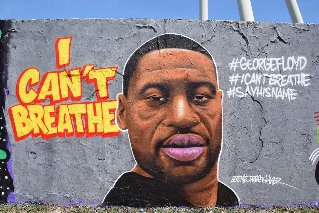
@eme_freethinker’s mural of George Floyd on the Berlin Wall demonstrates beautifully our interconnectedness (Wikimedia Commons).
There was a sale on audio books, so I am listening to a Great Courses lecture series called Understanding Complexity by Scott E. Page. I thought it would be nice to have an introductory overview of what other disciplines mean when they talk about complexity.
Early on, Page introduces a lovely metaphor. If we are willing to map outcomes onto landscapes, he suggests there are three kinds of landscapes that model problems. The idea is that better outcomes are the equivalent to higher peaks.

[Mt Fuji – Wikipedia]
Mt Fuji landscapes are essentially conical. No matter where you are, it’s clear where you need to go to climb higher. Simple optimization problems are Mt Fuji landscapes.

[Rocky Mountains – Wikipedia]
Rugged landscapes are ones where the tallest peak is not self-evident. It takes some searching to find the highest. The Rockies are rugged landscapes. It took a long time to be sure that Mount Elbert was the highest. Difficult challenges like building a nuclear bomb are rugged landscape problems. You need to invest a lot of time and effort into the search, but there is an answer and you will eventually find it. Along the way, you might find lots of good-enough answers.
This is a useful metaphor for explaining to practically minded people why it’s something useful to suspend some of the constraints of reality when conducting a search. It’s easier to explore a rugged landscape if you can temporarily suspend gravity, even if—in the end—you’ll need to respect it and climb the mountain once you’ve found it.
Page offers a third landscape in the metaphor. He calls them dancing landscapes.
Dancing landscapes change over time. The maxima and minima keep moving in response to all kinds of forces including your own attempts to move in them. Page struggles to describe this in terms of moving landmasses. I think the ocean is a better image.

[Ocean Waves – Wikimedia Commons]
He argues that complex adaptive systems are best understood as dancing landscapes. This means, amongst other things, that time is of the essence when attempting to intervene. What is a good idea now will not necessarily be a good idea later because conditions will change. He says that it’s why attempts to reform things are best done quickly.
I’ve been thinking a lot about this last point because it bolsters an idea that we hold but haven’t been great at defending: That longer time spent on research does not necessarily produce better results. I think this idea drives things like the DPPS being a 5 day encounter. We know that longer time periods don’t necessarily mean better outcomes. On the other hand, we know that all too often emergency is used as an excuse to force bad ideas through. I think that the idea of dancing landscapes gives us some tools to distinguish our approach from the irresponsibly urgent approach.
I think we could extend the metaphor by describing how to equip ourselves to navigate dancing landscapes.
– Written by Tim Maly. February 5 2020.
June 2020
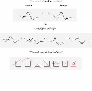
Transitioning systems from the present to the future requires shifts in thinking and behavior.
What does it take to transition? Consider the broad strokes sketch below, and what it communicates about the future of education in the context of COVID + civic life.
– Written by Sahib Singh
June 2020
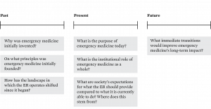
We are interested in the bridge between how we develop new knowledge to operate in today’s complex world, and how we apply that knowledge in practice. As a research organization, we are interested in exploring the gap between clinical expertise and how decisions are made in complex spaces within emergency medicine. Here are some questions that we believe will reveal the relationship between the details in context and the bigger picture:
- What is signal and what is noise in the ER, and how do clinical staff distinguish between them?
- When clinical guidelines, training, and protocols were insufficient for meeting the moment, what can clinical staff learn about the decision-making process?
- How do clinical staff respond when the mental models that help them prepare clash with the realities they encounter in the ER?
- How did EM come to be the way it is? An analysis considering timeline:
– Written by Sahib Singh
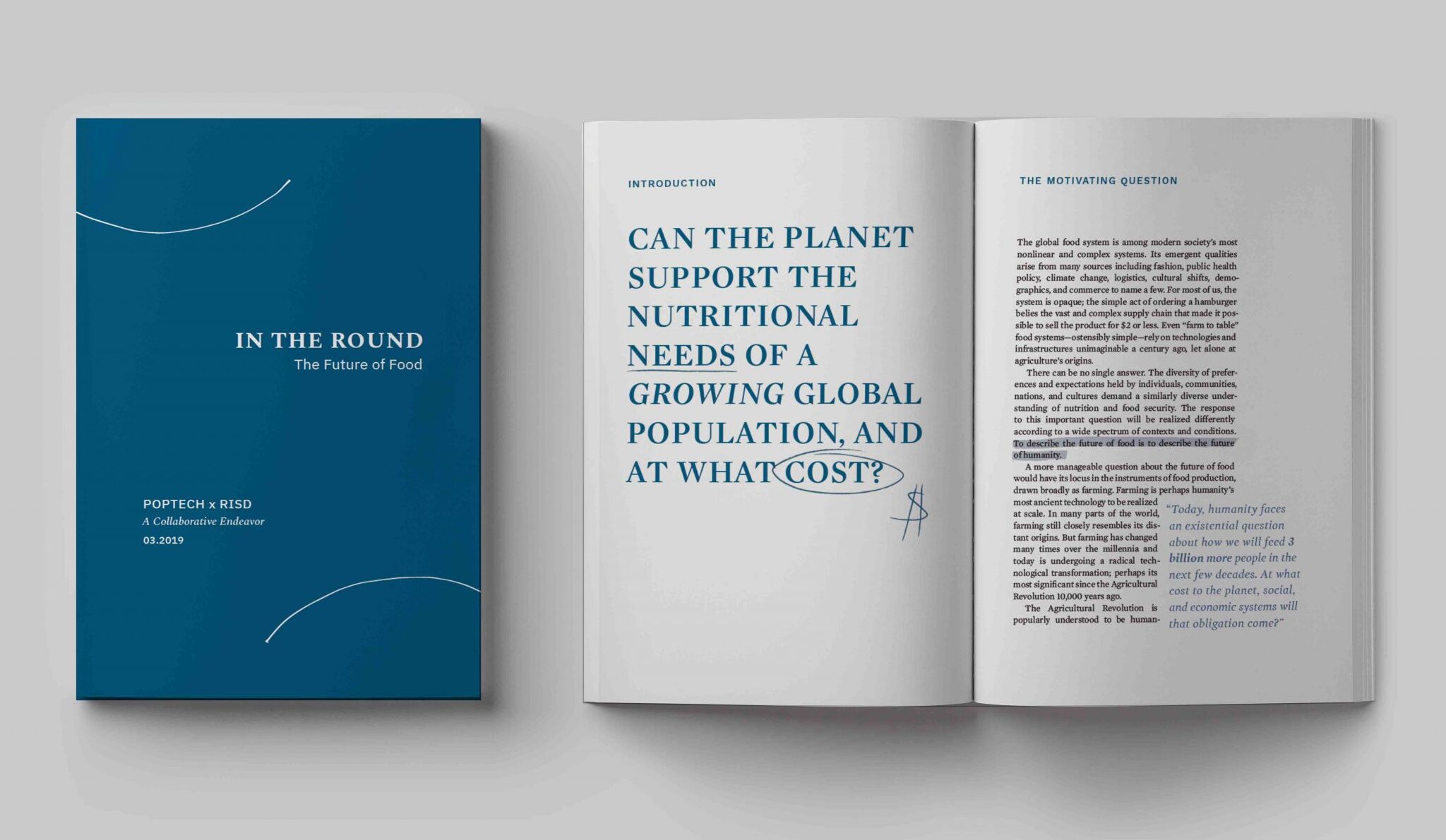
In collaboration with PopTech, the Center for Complexity (CfC) hosted a two day convening in March 2019 to discuss the future of food, conducted in-the-round. Conversations-in-the-round offer an experimental and collaborative forum where a variety of perspectives collide to reimagine how we should approach navigating complex challenges.
30 professionals, community leaders, ag-tech startups, policymakers, local activists, global aid administrators, and many other important voices in the food industry were in attendance. We did not set out to create solutions, rather we devoted our time to exploration — a process that allowed us to assess, discover, reality-check, and strategically plan the next phase of the journey. A publication was created to capture the discussions, workshops, proposals, deign principles and actionable next steps.
The outcomes of this first convening will guide what comes next. Our aim is to initiate a series of projects conducted by the CfC and our partners to advance the future of food according to shared design principles. We are working with PopTech to host further convenings.

